Primary Logos and Application
Available in both vertical and horizontal formats, the Georgia Gwinnett College logo serves as the core element of the college’s visual brand identity.
The Georgia Gwinnett College name, its logo and its logo and name variations are trademarked (PDF) and not to be used without Communications' expressed permission.
Primary Logo – Vertical Format
The primary logo of Georgia Gwinnett College is the double G icon centered over the type Georgia Gwinnett which is centered over the word COLLEGE.
Two color and one-color provisions have been provided for this mark on both light and dark backgrounds as is illustrated here. NOTE: on dark backgrounds, only use the one-color option reversed to white.
Primary logo – full color

Primary logo – one color – light backgrounds

Primary logo – one color – light backgrounds

Primary logo – one color – dark backgrounds

Primary logo – one color – dark backgrounds

Primary Logo – Diagram of the Logo
Georgia Gwinnett College's logo, known as the "Cresting G," is comprised of two capital "G"s that echo one another. The space between the two letters is filled with Georgia Gwinnett Green (PMS 3425), which strengthens and stabilizes the mark.

Primary Logo – Horizontal Format
Two-color and one-color versions have been provided for this mark on both light and dark backgrounds as is illustrated here. NOTE: on dark backgrounds, only use the one-color option reversed to white.
Primary horizontal logo – full color

Primary horizontal logo – one color – light backgrounds

Primary horizontal logo – one color – light backgrounds

Primary horizontal logo – one color – dark backgrounds

Primary horizontal logo – one color – dark backgrounds

Primary Logo – Common Misuse
Do not reverse colors.
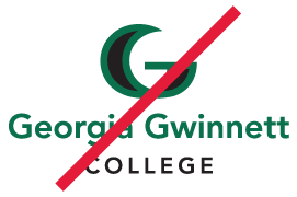
Do not use colors outside of the approved color scheme.
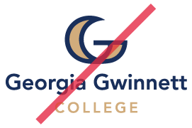
Do not resize components.
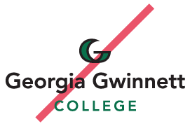
Do not rearrange components of the logo.
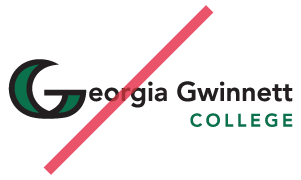
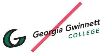
Do not skew, stretch or rotate the logo.
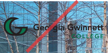
Do not place the logo on visually confusing backgrounds.
GGC Logo Application
Isolation Area
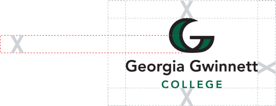
An area of isolation has been specified for all logos in the system. This clear area must be maintained around all logos at all times.
No graphic component, type, fold or edge may fall within the isolation area of each logo.

Minimum Size Requirements
Minimum size requirements have been specified for all logos in the system. Under no circumstance should logos ever appear smaller than their required minimum size as shown here. All logos appear actual size.
1-inch

1.5-inch

Restrictions
With very few exceptions, the cresting double G is not to be decoupled from the logo.
Retired Logos
Retired logos and graphics should no longer be used.
Retired GGC Logo
Classic Grizzly
Retired GGC Logo
Athletics
Retired GGC Logo
Grizzly Strong
Retired GGC Logo
Quarter Facing Bear
